N is for...nudges
Five biases in the ways our brains are built that can level up your comms planning
Imagine as a child you’ve spent your entire life in the sanctity of the cave, then one morning your cave-parents think you’re old enough to help carry some berries and you’re suddenly thrust into the gathering crew.
You excitedly make your way outside for the first time.
Sensory overload.
Your eyes hurt and you squint as you experience sunlight for the first time. Ouch.
Suddenly that thudding noise you heard and felt each morning in the cave with the other cave-kids gets much, much louder as an enormous green thing plods past you.
You freeze. WTF is that?!
However you see your cave-crew keep calm and carry-on berry picking as they know the big, tall, green animal things with the really long necks are only really interested in the green things, on top of the brown things, that are sticking out of the ground… not cave-kids.
You come to learn it’s the aggy ones with the short arms and the sharp teeth they seem to be scared of.
This is deliberately simplistic (and most likely historically inaccurate) but psychologists often use the caveman metaphor to explain the purpose and function of our brains.
We developed our senses to stay alive and continue as a species.
Using all of them all of the time to make sense of, compare, contrast and categorise what’s in front of us as potential food, threats, mates or dates.
Logging what we’ve learned in ways that can be re-called in the future.
More significantly in our world of brands and advertising, not just learning through our direct interactions with the world, but learning indirectly through others as well.
As the way we think, feel, act and react to what’s going on or what presents itself on the eyeline is shaped by what others think, feel, say and do as well.
If your cave-crew run from the dinosaur, you’re likely going to follow.
Fast-forward a few millennia these instincts we developed to stay alive back in the day stay with us today; representing a goldmine for brands and advertisers who either consciously, or by happy coincidence utilise these cognitive hacks across their marketing.
Therefore spending just a little time familiarising yourself with some of them may help you level up your comms and media planning on your next campaign.
With this in mind N is for…Nudges
Where I’ll walk through five biases that shape the decisions we make courtesy of the way our brains are built; tricks of the mind that cost no more to use but may help each $ a brand invests in advertising get more people thinking, feeling and acting in the ways they would like them to.
These are by no means exhaustive, but are ones I’ve found helpful, which have implications for the ways we craft and construct our media plans.
First up is the novelty effect
To stay alert and alive, we hardwired the instinct to pay more attention to things we don’t recognise, or that stand-out and stand apart from the norm.
Then compare, contrast and categorise that thing and to “freeze, flight or fight” our way to safety.
You see this play out in loads of ways in our world.
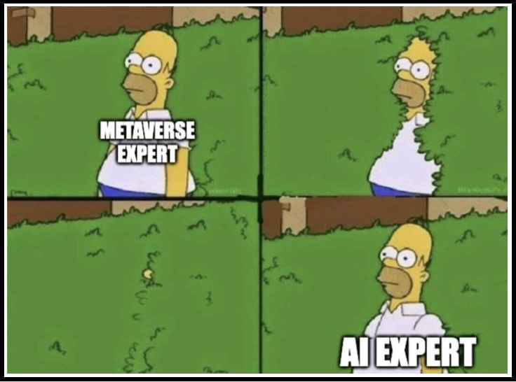
Be that thought leaders rushing towards and away from The Metaverse and into A.I. as the shiny new thing, that promises to change everything; or brands that roll-out new flavours and formulas to get people to try them again.
But what of our media plans?
The choices we make can help brands hack a little disproportionate attention by showing up in people’s eyelines in new and novel ways.
I’ll share three ways in that might help you achieve this below.
Can you utilise New & Novel ad-formats?
The easiest way to unlock the novelty bias in our media plans, is to incorporate newly available ad-formats – as by their very nature they stand-out vs. standard ones that audiences have become familiar with – in doing so stopping thumbs a little longer or creating that second glance you may not otherwise benefit from.
As part of a previous life I ran a program for Unilever’s global media function that trialled new partners as well as new ad-formats within the usual suspects; before giving a yay or nay on whether that partner / format should scale across other brands and markets.
We’d use variations of a measurement methodology I drew up below and run multi-cell tests to pull apart and benchmark each format, or each new creative use of a format and judge their relative performance vs. Unilever norms.
Across the board we saw new formats outperform established ones time and again
by roughly 40% on levels of attention / engagement / action as they benefit from the novelty bias; an initial advantage that would erode over time towards the norm as the novelty of that format wore off on audiences.
Brands can create a first mover advantage by leveraging alphas and betas across the big digital platforms, or by populating new spaces made available for commercial street art, or even by playing with well-known landmarks to game your audience’s attention.

However new spaces, be those alphas and betas with minimum investment commitments to access, or more public spaces like those Bottega Veneta use that require councillors and landlords to get paid can come at a relative premium and can’t realistically achieve everything a brand might need to.
Therefore try using old media in new ways…
Which is where creative uses of media can help enhance what a brand has to say or convey; to help propel a creative idea further and faster than conventional formats.
This can be achieved via bespoke builds that get more noticed not just because of what’s being said, but how it’s being said, and by taking a conventional space and using it as a canvas to create a new and novel experience with or within it.
OOH is a wonderful playground for this, Marmite and The BBC’s explosive and fiery special builds being great examples of an exclamation mark on their campaigns.

These can exist as standalone executions, or can help propel the whole campaign.
We helped our Volkswagen clients flex this approach across all media when launching the VW T-Roc SUV; giving the campaign’s mascot “Bam the Ram” the ability to smash its way into other brands advertising to help convey the toughness of this little SUV.
There’s a lovely breakdown from the team that developed the campaign on Thinkbox.
Try creating your own media beyond the ad-space
Alongside tried and trusted channels, think of spaces where you might connect with audiences that aren’t overloaded with brands and advertising, as these represent opportunities to be seen on stage without others getting in the way.
Heinz ketchup is doing this particularly well as of late, who seem to be on a mission to find fresh ways to set social media alight with everyone’s love of ketchup; flexing their distinctive iconography in ways that get people talking.

Need a white space to start your search?
In my opinion gaming represents the connection opportunity with the highest volume of attention that at this moment in time is least populated by brands and advertising.
Take a look at J is for Joysticks for some jumping off points
Next up is the distinctiveness bias
We’re not just hardwired to notice the novel and the new, we’re also more likely to give a second glance, remember and recall that which is distinctive.
A bias with significant support within academia dating back to 1933 with the breakthrough experiments of a young researcher Hedwig von Restorff, who gave students long strings of text to test a hypotheses around which elements would be remembered and recalled most strongly.
Unsurprisingly, the combinations that were deliberately distinct in the way they were represented were recalled more often than the other random combinations of letters; giving birth to the “Von Restorff” effect (a pretty distinctive name for a bias in and of itself) which proved out when multiple similar objects / ideas / information is present, the ones that differ from the rest are most likely to be remembered and recalled.
ome examples of which are laid out in the graphic below.
I see the distinctiveness bias in our world being significant on two levels.
Firstly it can be used to help advertising stand out in the context it’s experienced within and get more attention than it otherwise might.
Like the blue circle cutting through the uniform squares above.
However stand-out, without consumer take-out is art rather than advertising.
More significantly through the development and deployment of what we now have come to call distinctive brand assets throughout the marketing mix, brands can better ensure they’re remembered, recalled and ultimately acted upon.
I’ll illustrate this bias in action with a famous example in Cadbury’s Dairy Milk.
The confectionery giant had been caught up in a salmonella scare in 2006 leading it to recall more than a million bars of chocolate.
Not ideal.
The nation’s favourite chocolate had lost some of its lustre.
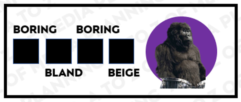
To kick-start a new trajectory back to growth their ad-agency Fallon concepted “Gorilla” an ad three times longer than a normal TV ad, that doesn’t feature any chocolate, which has no explicit message, but implicitly came loaded with bags of enjoyment; the same enjoyment you might get from eating a bar of their chocolate.
This worked on a basic level to stand-out and stand apart within the ad-break itself.
Stand-out. Tick.
More significantly it worked beyond the initial execution by re-programming people to associate “joy” with the famous purple and white, rather than “salmonella”.
Take-out. Double-tick.
The brand’s trajectory was re-set back to growth.
Even though the visual identity of a brand and the subsequent advertising that follows may be the domain of creative teams, the choices we help clients make in media can unlock the power of the distinctiveness bias in ways that can compound over time.
Firstly do we need to (re)establish those distinctive assets?
If so big, bold and public media is required to make them famous.
My old agency handpicked the TV spot schedule when launching the Cadbury’s spot into our public consciousness.
Big, shared viewing occasions that not only delivered eyeballs but got people enjoying the ad together, creating shared enjoyment and meaning.
Public adverts are one mechanism, but public figures can also help.
When launching their “I’m Lovin’ it” jingle (or sonic signature as the pro’s might call it) McDonald’s signed-up Justin Timberlake to help lodge that earworm firmly into place across the world.

A jingle that subsequently signed off all McDonalds ads moving forwards and is now so well associated with them it triggers hunger when it’s heard.
Wrap your distinctive assets around the occasions your product is most relevant
Which don’t necessarily need adverts in their standard form.
In H is for…Heineken I shared how an old Heineken client set about re-setting perceptions of their beer from awful to aspirational by wrapping their red star, their green bottle and their tagline of the time around the actual things the people they wished to recruit into the brand most eagerly anticipated, enjoyed and opened a beer in front of.
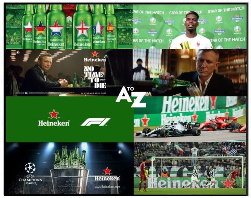
Which helps contribute to them being perceived as a more prestigious option within the mass-market segment they serve.
These big expensive plays are all well and good for scaled brands with scaled budgets, but what about brands that are scaling up which may not have the resources required to sponsor Bond or bring Beyonce along to feature in their next campaign.
Think about under-utilised channels or contexts
The hottest media properties tend to be overloaded with ads, hence it might be beneficial to seek out alternative stages without as much accompanying noise.
Our Oatly clients are masters of this; where our teams work together to handpick specific spaces that best serve the message they’re trying to convey to those it’s likely to resonate with.
A good example being the use of murals in their signature aesthetic in and around the trendiest coffee-houses in town that now serve Oatly; because if it’s good enough for them it’s good enough for you.
Which neatly overlaps with the framing bias
As the way a message is presented and the context it appears within can significantly influence how that message is received, perceived and acted upon.
A good example of this is from my wife’s line of work.
She runs a state-run primary school in South-East London, a dense neighbourhood with an intake of kids on a spectrum from those who unfortunately have very little (money wise) alongside those who have everything anyone could ever need.
As a school they deliberately have a school uniform policy that ensures families aren’t pressurised into buying and dressing kids in what the playground deems to be cool.
They also make uniform colours based rather than crest based to make it as affordable as possible; but buying new uniform every time a kid leaves it somewhere, wears through it, or grows out of it, simply isn’t affordable for increasing numbers of families.
For many years the school held second-hand sales on the changing of the season to help parents access uniform affordably if they needed to.
Nobody ever came.
Piles of uniform would end up being taken to charity shops at the end of each term.
On the advice of one of the parents who ran a vintage clothes store they re-framed it as a pre-loved sale where you could pay with a notional amount of money, or with uniform that could then be passed on to another family.
Good for the wallet. Good for the planet.
The sale became so popular that the school had to create a pre-sale for the parents they knew who genuinely needed it the most.
This simple act of re-framing removed the stigma for families not wanting to admit they may not be able to afford to buy new, as well as strip away the notion that second-hand uniform is in some way an inferior choice.
A great result courtesy of a simple re-framing.
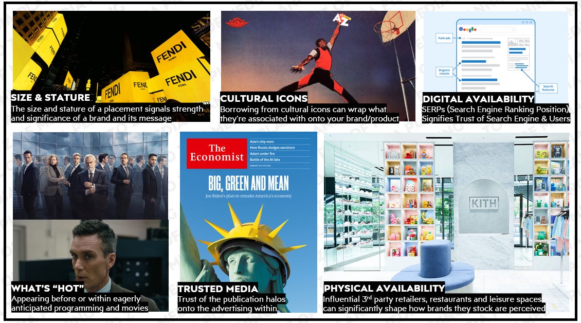
Which has significance in our world as there are a multitude of elements in addition to the message which can influence consumer take-out and take-up.
A few of which I’ve outlined in the graphic below.
Some of which may require a little lateral thinking to unlock.
Let’s take Distribution or Physical Availability as labelled above as an example.
When Sidney Frank was launching the premium vodka brand Grey Goose, he wanted it to be on the top-shelf in bars as it would enable Grey Goose to a) be in the eyeline and b) be alongside the expensive whiskeys and cognacs he wanted the brand to be anchored to rather than the other cheap and nasty vodkas.
Vodkas at that point just wouldn’t find a home there.
So what did he do?
He designed the bottle to be extra tall so it wouldn’t fit on the shelves below thus would have to be put on the top shelf.
In doing so creating a distinctive bottle shape that they’re now famous for, resulting in Bacardi laying down a cool $2BN to take the brand into their ownership in 2004.
Think about which elements beyond the message itself may add some credibility, authority or some persuasive punch within your next campaign or activation.
Creating target contexts, or ideal messengers that may help shape the way your brand or messaging is remembered.
Which neatly leads onto…
…The power of Social Proofing
Social proofing, or more simply the sense that others are doing something, or thinking something, is a force that’s so strong it can even work in the absence of people actually doing it.
Just ask teenagers of a certain age.
Or refer to one of my favourite tales from marketing that leverages the power of social-proofing told by Richard Shotton who shared a story from the early days of Red Bull.
Who faked it until they made it.
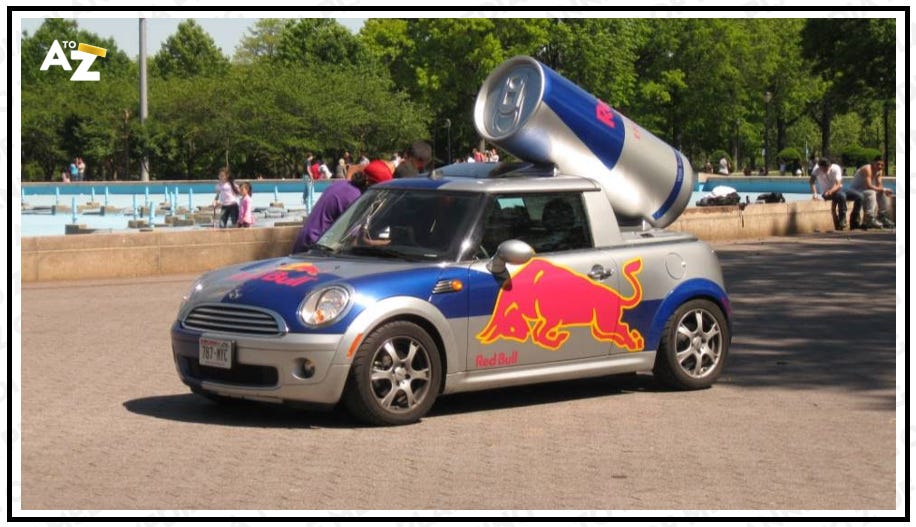
A big part of their early growth came from paying attractive university students to drive cars that looked like massive cans of Red Bull and go to university social nights handing out free samples.
A cheap way to drive trial amongst time-poor, energy-sapped students.
Never one to miss a trick though, instead of binning the empties the sampling crew would take them to the most popular nightclub in town, dump them into, on top of and onto the floor next to the nearest bin in front, creating an illusion of popularity via the sense that everyone was drinking it before going to the club as the bins were overflowing with them.
Genius.
Layer on some authority where required
If you can create the sense that not just lots of people, but people with authority are on the side of what you wish to say or convey, you can add even more persuasive punch.
As people often look to others for guidance in uncertain situations; like our cave-child sensing his cave-crew’s blasé attitude to the diplodocus, or in modern times when we seek the advice of trusted doctors and clinicians, or ratings and reviews on Amazon & TripAdvisor.
But what of the way we craft our media plans?
I find using a grid like the one below can help me plot which messengers I might use in which ways on a campaign, that I find helpful when tasked with stretching an initial idea that may be born in a TV script beyond brand-out communications.

If you need some context as to how flex different modes and messengers to create some target contexts for your next campaign I walk through this tool above, through the lens of Nike both broadly across multiple campaigns and specifically with their iconic “Londoner” campaign in the second part of C is for…Context
Last but by no means least. The Scarcity Bias
Which comes into play when people place a higher value or sense of urgency around goods and services that are perceived to be in limited or short supply.
A trick of the mind that’s been deployed so effectively by advertisers that certain legislators have restricted the instances scarcity biases are allowed to be used.
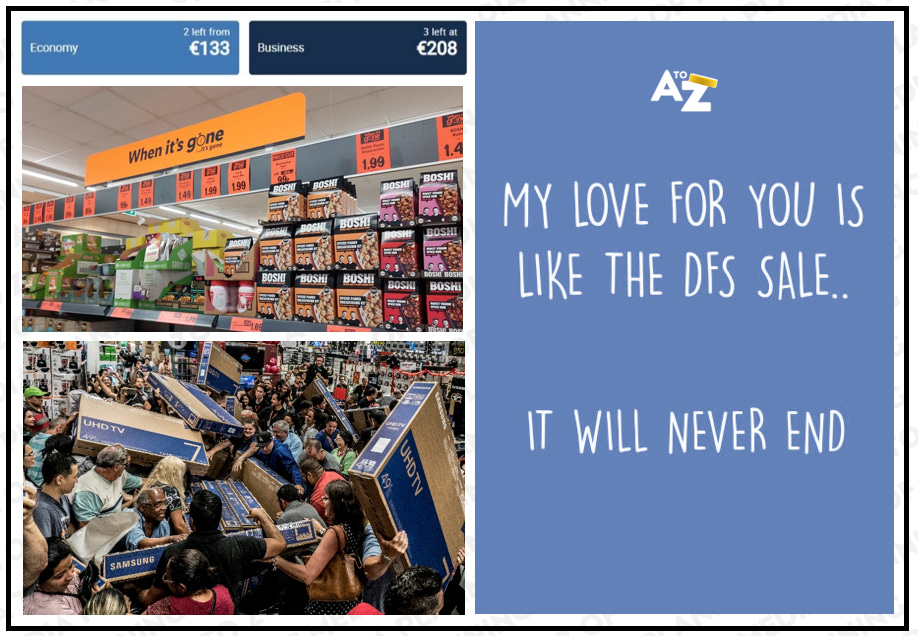
“5 seats left at this price!”
“2 rooms remaining!”
“When it’s gone it’s gone!!”
“It’s a bad season for avocados!”
“There’s a Toilet Roll Shortage!”
“Black Friday Mega Double Discount!”
“DFS Sales Ends Monday!!”
As well as compelling people to buy now, more interestingly the scarcity bias can help establish objects of desire and obsession that get people not just buying, but paying a significant premium to acquire.
Let’s take Rolex as an exaggerated example.
Even if you want one and can afford one, you can’t easily buy one.
They’re incredibly expensive and incredibly hard to get hold of, which makes those that do manage to get hold of one signal that they’re not just loaded, but well connected too.
An attractive combination for potential partners (and potential thieves alike).
Rather than remedying this and increasing supply to capitalise on excess demand, Rolex lean into it by saying scarcity isn’t a strategy per se, but it takes so long to train people to make and repair their watches to their exacting standards it would take years before they could create any meaningful increase in supply.
Reinforcing the logic people use to justify the financial and logistical efforts they put into play in order to get hold of one.
Hence the myth and the magic and the higher re-sale value vs. RRP continues.
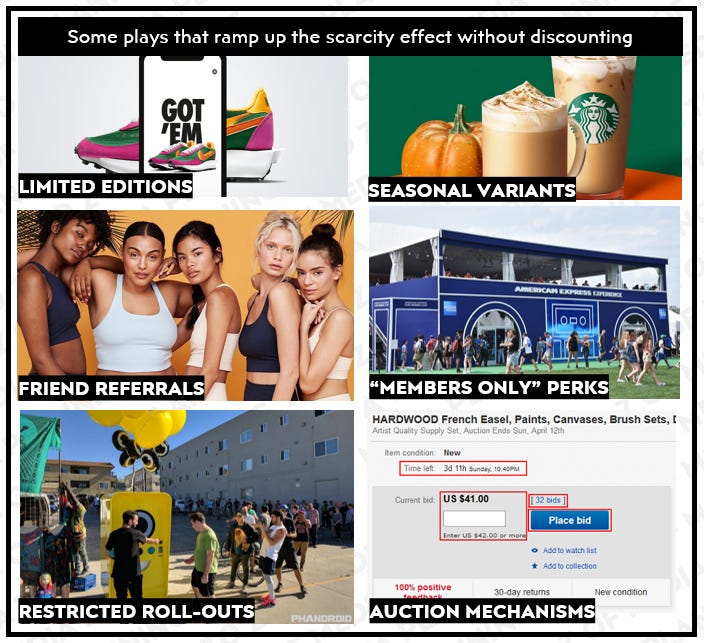
Therefore as well as thinking about how limited time discounts might pull an existing consumer purchase forwards (less profitably) think about how placing constraints around how, where, when and how much people have to pay to acquire or access what it is you have to offer could dramatically increase desire and what they might be willing to pay.
Some examples you might consider as part of your armoury are as follows.
Which are flexes a brand can make that in reality may only be experienced by a few, but simply knowing of these opportunities that are being taken up by others can shape the way a brand, product to service is perceived.
An example from my time working with Magnum Ice Cream, who were scaling out their “Pleasure Store” pop-up stores across the globe where people could make their own Magnum complete with their favourite ingredients and dress it in lavish toppings.
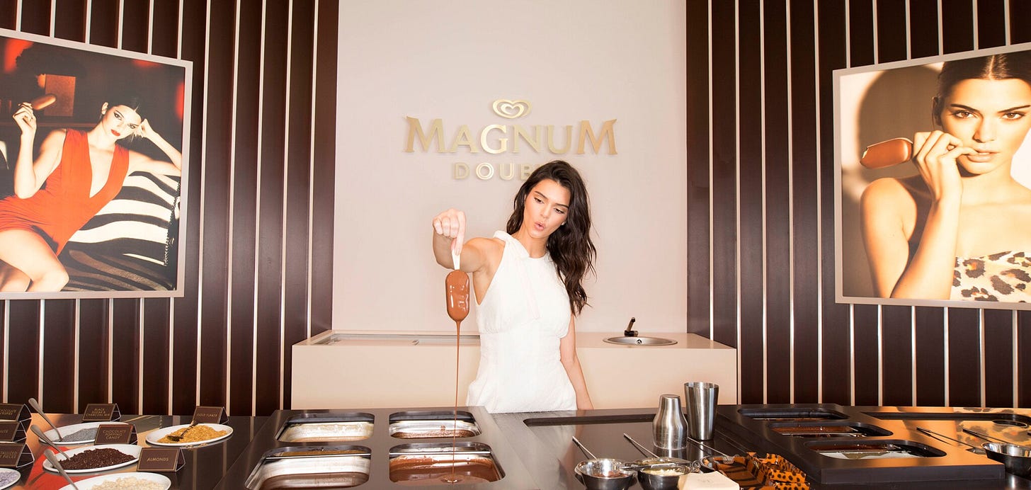
As you might expect those who built and enjoyed their own Magnum in a Pleasure Store had a 50x uplift in brand equity measures ( a composite measure comprising quality / appeal / consideration / willingness to pay ) vs. exposure to ATL advertising.
Interestingly even just knowing of these pleasure stores and what was on offer within then had a 7x uplift vs. that same exposure vs. their ATL ads.
Combining the scarcity bias, with a healthy dose of social proofing to good effect.
In summary
I hope you’ve enjoyed reading this post as much as I enjoyed writing it.
We spend so much time in our jobs debating brands, advertising, vendors, formats and standards we can be forgiven for forgetting the true recipients of what we produce - that being “the brains” of our target audiences.
Brains with functions that were built millennia ago, with biases that shape the way we think, feel and react to the stimulus we put in front of them that we happen to call advertising today.
This post dives into just a few of the ways you might play with these in media and comms planning - to make what it is you’re trying to say, or convey in a more compelling manner.
If you’re interested in the practical application of decision science in marketing I’d urge you to pick up a copy of Richard Shotton’s book; he goes through 25 of them.
If you’re interested in it’s broader interplay within politics, socio-economics and society at large check-out the work of Rory Sutherland.
Until next time, where I’ll be writing a love-letter to Outdoor media.
Thanks,
Matt


