
D is for...Data
Use data to help form the logic, fast, so you can bring the magic

When starting out The A to Z of Media Planning I recalled the most used and misused word in advertising’s vernacular; with A is for Audience.
On reflection when preparing for this latest chapter, I think I’ve rendered that initial quip obsolete.
The fragmentation of media has made marketing communications more complicated.
Some might argue more so than is necessary.
Instead of one set of ads being concepted, researched, signed off then distributed through different vendors; we have in some instances limitless variations of ads being generated in real time – served to individuals that have been deemed more likely to be receptive to one visual hook vs. another based upon their relative behaviours across the internet.
This has been made possible with the rise in prominence of digital media.
A medium and interface between brand and consumer that has created so much possibility. I’m not going to dedicate this chapter to Digital though, because I think there is something more pressing.
As more investment, across more plans, has been channelled through digital touchpoints, we’ve seen an exponential increase in the volume of Data being generated, mined, refined and talked about.
Junior Data Analysts, Senior Data Engineers, Data Science Executives, Marketing Data Strategists are popping up in various guises talking about lakes, clouds, cleanrooms and plugins; with language more reminiscent of an IT consultancy than consultants and advisors on marketing communications and media.
I jibe to make a point.
But the secret is…whisper it quietly…you don’t need to be an analyst to be analytical.
Yes there are many elements of what we do that definitely benefit from specialists.
There are also many datapoints and ways of pulling those datapoints together for cliennts and colleagues that can strengthen our understanding of our clients world… make better recommendations… lead to bigger ideas… build more compelling activations… deliver better outcomes that we don’t have to outsource the creation to teams of specialists with pivot tables.
So in this chapter I’ll break down the ways that I use data at different points in the preparation, planning, optimising and reporting of media that I’ve found helpful to get to grips with; to better support clients and colleagues.
Therefore D… is for Data
Before I go into the specifics of how I use data, I think it’s important to set out my view on how data should be used.
The dictionary definition of data is…
“Facts and statistics collected together for reference or analysis”
Reference or analysis that hopefully leads to better decisions
Although you can never guarantee : /
Before I dive into how I do that in our field, let me use a familiar example from another field that does just this in ways we can draw parallels from.
In this case the sports field.
Science vs. Scouts

Michael Lews’ Moneyball tells the story of how Billy Beane’s Oakland Athletics, when faced with limited budget to build a squad of players for the coming season, pioneered a new method of squad-building alongside his Assistant GM Peter Brand.
Convention saw scouting teams of male, pale and stale ex-players use their “eye” and “gut” to make recommendations on which players The A’s should try and sign to their roster for the upcoming “campaign” (sound familiar?!).

Faced with the constraint of a lack of funds relative to the competition, Beane & Brand pioneered an approach to scouting using data that uncovered talent that was undervalued; both in terms of what they were paid, but more importantly what they contributed on the field.
One example of this would be prioritising the % of times someone batting gets to first base, over and above how often someone might hit it out of the park or their technique in doing so.
Why was this the case though?
More base progressions = more expected scores = more expected wins over the course of a season.
This approach to squad-building in a purely objective way, stripped away the subjectivity of the scouting team.
Watch the best scene from the film here where you see the science rub up against the scouts head on.
It enabled The A’s to build a more effective team, in a more efficient manner.
It saw them scale new heights.
It saw Billy Beane be hired by The Boston Red Sox and go on to win The World (of the USAs best baseball teams) Series.
It saw this “Value” led approach to squad-building adopted by The Red Sox owners more famous sporting franchise Liverpool F.C.
Under the tutelage of Sporting Director Michael Edwards, they moved from upper mid-table obscurity, to winners of The Champions League & The Premier League against their vastly better funded competitors of Manchester City, Chelsea & Manchester United.
Data helped them find a better way.
Moneyball is a brilliant example of how data, used in an objective way, can help uncover insight that challenges convention; but more importantly changes the way an organisation makes decisions moving forwards.
Using data from different sources to get a sense of what’s broadly going on. Fast.
Much faster than a team of scouts or so-called experts could ever hope to accomplish manually.
Then use investigative skills to uncover real meaning and the real-world implications of what they discovered.
Which is exactly what I preach to young planners I’m fortunate enough to help school.
Use tools, techniques and subscriptions at hand to scan what’s broadly going on as fast as you can – so you can spend more time figuring out the why behind what’s happening and what you might subsequently do about it.
The following are my go-to’s that do just that, at different points in the planning process, to help make better (or at least more confident and coherent) choices faster than I otherwise might.
Which tend to sit like a dumb-bell at the start and the end of the process.
Exploration | Use data to help figure out what’s broadly going on
Strategy | Use data to help assert exactly what needs to be done
Planning | Use data to craft a more robust plan
Implementation | Use data to help standardise and optimise to the best possible outcomes
This list is by no means exhaustive, but these posts have word limits!
I’ve deliberately left out the use of data in targeting, because this is in-flux.
I’ve deliberately left out the use of data in analysing the effectiveness of media, because I’ll be dedicating a whole post to that later down the line.
I hope you find some of them helpful.
Exploration | Use data to help figure out what’s broadly going on
When I’ve got the time I try and investigate what’s going on through the following dimensions, that help paint a broad picture of what’s going on in the market a client’s brand is trying to win within. (Most agencies I’ve been part of have had a problem definition or exploration stage that tries to get a sense of the following).
I’ve put together a little crib-sheet to keep in daybooks…
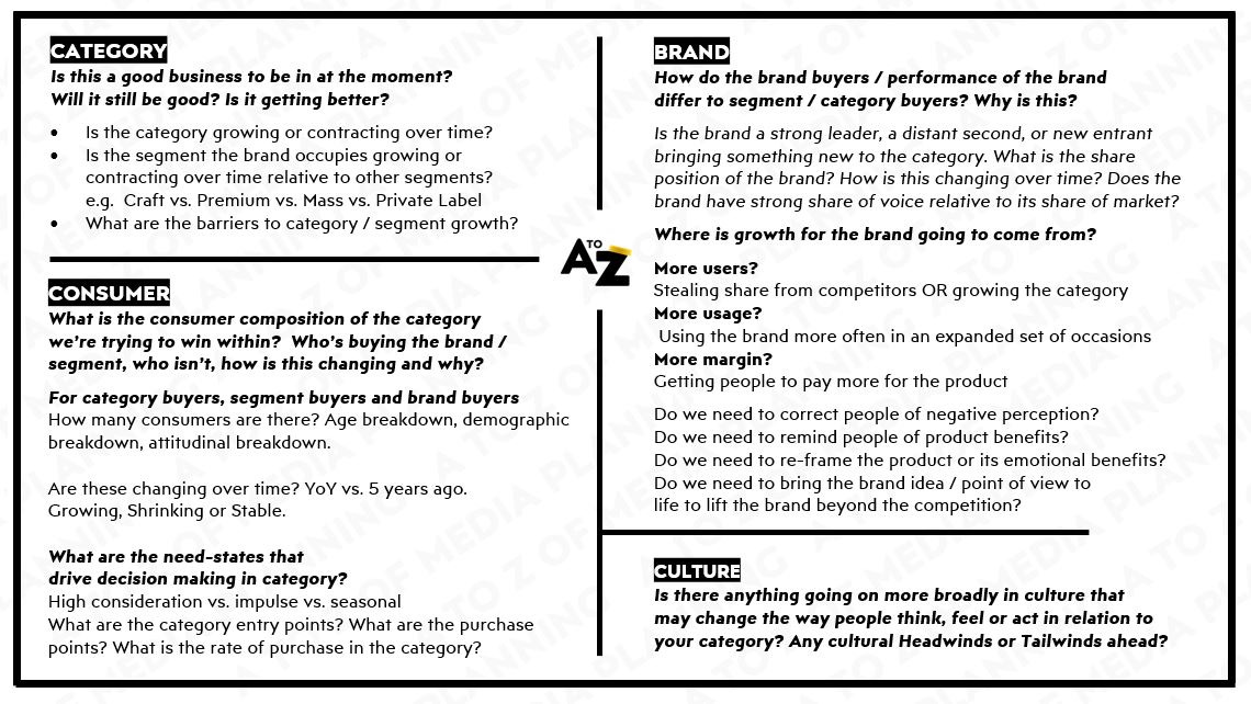
Data from different sources is fundamental to building this understanding.
In scanning these areas, patterns emerge and the real problems a client needs to solve tend to show themselves.
Some tools and techniques I go to time and again to help scan quickly, are as follows…
Google Trends
Is a dead easy tool to understand general trends over time, and trending terms in a moment.
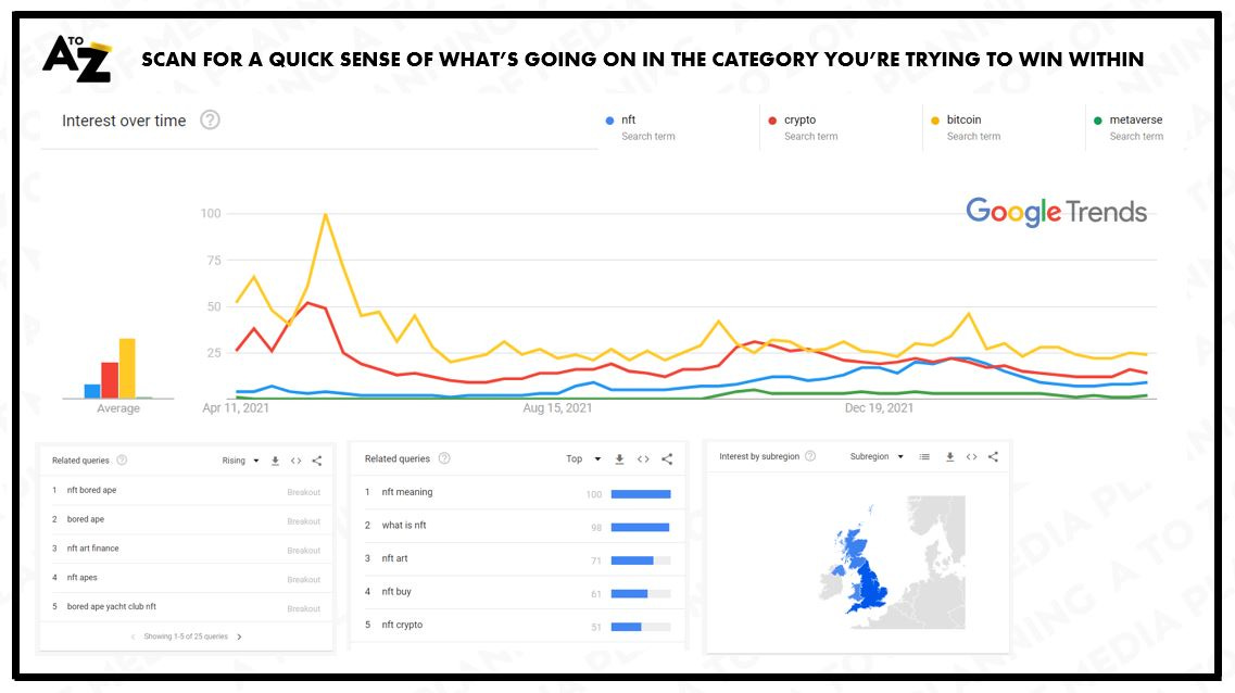
You can get a sense of how your interest in your brand or category is growing or shrinking.
You can get a sense of how your brand is faring vs. direct and indirect competitors.
You can get a sense of what associative terms or topics are the most searched for, or trending in the moment.
You can see how this differs across geographies or countries.
You can do all of this for free and in a few minutes.
Search as a Diagnostic tool
As search is such a leading indicator of purchase in many categories, you can also use it to act as a proxy for the health of a brand or category and even as a predictor of future purchase in the most correlated categories.
This was particularly important when the pandemic hit.
At the time we worked with our friendly Google representatives to help one of our clients understand just how deep their category would be hit as the relationship between search and sales was so strong for them.
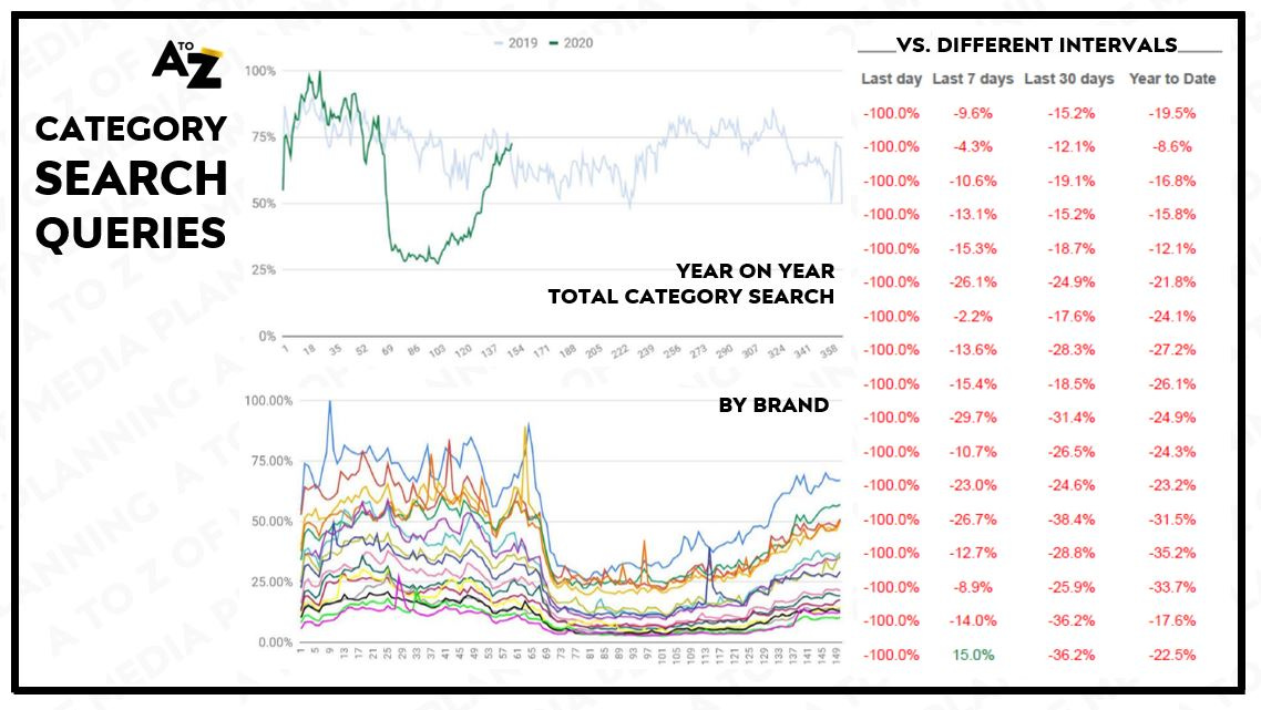
By tracking and plotting trends data day by day vs. 2019 we could help our clients project when category demand would return towards normal, so they could switch their media investment levels back to normal sooner rather than later and not miss out on any pent-up demand.
Hang on a minute…
“Google Search is just one signal of many signals!!”
“Don’t 42% of all product searches start on Amazon?!”
“We need to think about search more… holistically : / ”
Depending on which types of behaviours, in which types of contexts are important, combining different data sources can get to a better sense of the shape of behaviour in a market.
As with the previous example.
We didn’t just rely on the Google Search data in isolation, we combined it with other sources that we could also triangulate on a daily level.
Notably web analytics from .COM to see if search volumes were correlating with website performance, as well as YouGov’s BrandIndex to track brand sentiment relative to its peers.
The whole picture being more credible in re-building confidence client-side than just one datapoint in isolation.
Another example of mixing and matching sources in this space would be from my time working with Unilever.
Their foods business at the time were putting customer journeys at the heart of their marketing planning in a big way, but had an unhealthy bias to Google’s touchpoints as being the one and only way to connect with consumers actively researching what to plan, buy, cook or enjoy for dinner.
To remedy this we combined different data sources, from different vendors, to help visualise the relative scale of behaviour in the foods category to help sharpen which they might prioritise moving forwards.
We called it a Holistic Search Radar (bleurgh)…
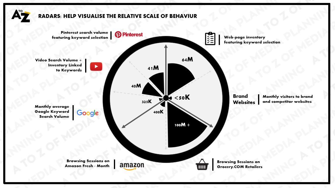
Unsurprisingly in an FMCG category with little to no research for most types of habitual purchases, Google Search wasn’t nearly as sizeable or as important as their friendly Google representatives suggested and score-carded each brands performance against.
YouTube search for recipes and the like was way more scalable than Google search by a factor of 100X – but it took us to help them realise this rather than their siloed Google representatives.
Grocery.COM and the digital shelf were mission critical.
Pinterest at the time a massive blindspot.
All it took was a neat visual to help switch the light on.
Which leads onto the next technique.
Funnels
A lot of people make fun of funnels.
I have done more than once. “Ooh I’m in consideration mode?!”
Visualising one brands or a client’s own funnel data, on its own, out of context, isn’t that helpful or instructive for what’s going on in a market, or across a set of markets.
However, using them to help compare and contrast the strength of a brand relative to different competitors, consumer groups or geographies – can be both super simple and super useful as a diagnostic tool.
Broadly speaking the fatter the funnel, the stronger the brand.
An illustrative set of data below shows what the relative set of funnels might look like for Airlines in the UK.
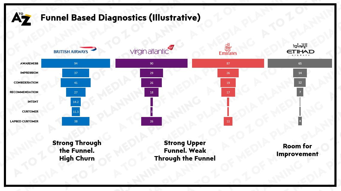
The more people that are aware of a brand + the better that brand does at converting that awareness into consideration, intent, purchase and advocacy – the stronger the brand.
By having a view of the whole market, rather than just one player within it, you can then start to correlate different funnel “stages” to one another, or to other business metrics available from alternative sources.
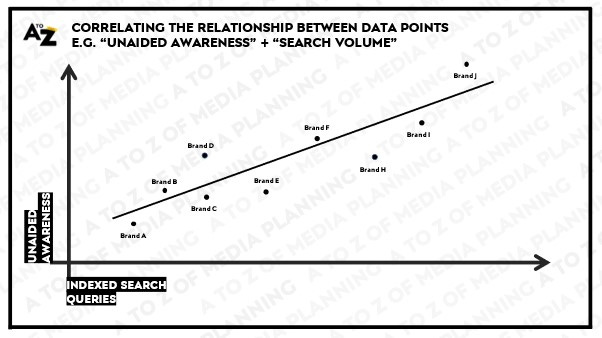
An illustrative example might be to correlate the levels of Upper Funnel Metrics (e.g. Unaided Awareness) to Lower Funnel Performance (e.g. Branded Search Volumes) to help paint a picture of what’s going on.
Once you know what is strongly correlated to the outcomes you and your client wish to deliver, you can easily track these types of metrics over time to see whether the strategies you have deployed are delivering your desired outcomes; be that fatter funnels or higher levels of unaided awareness to deliver higher search volumes.
Most importantly you can start to sense what the blockages to growth might be.
Brand vs. Brand or Market vs. Market funnel data can become the starting point for a more thorough investigation of what’s going on; which is the most important part because don’t forget there are real people on the other side of the data.
Be that leaders at competitive organisations that are trying to win within the same market as you - check out their annual reports as you’ll often find their strategy for fattening their relative funnels articulated loudly and clearly within them.
But also, users, buyers and consumers of the category.
You’ll only get to a true understanding of what they do in-market and why, by getting closer to their real worlds and having real conversations with them.
Whilst a few brands may not feel the need to advertise to fatten their funnels, at some point, most brands need to take the medicine and bring what they have to offer to groups of people beyond those that are already within the funnel.
Which leads to the next technique…
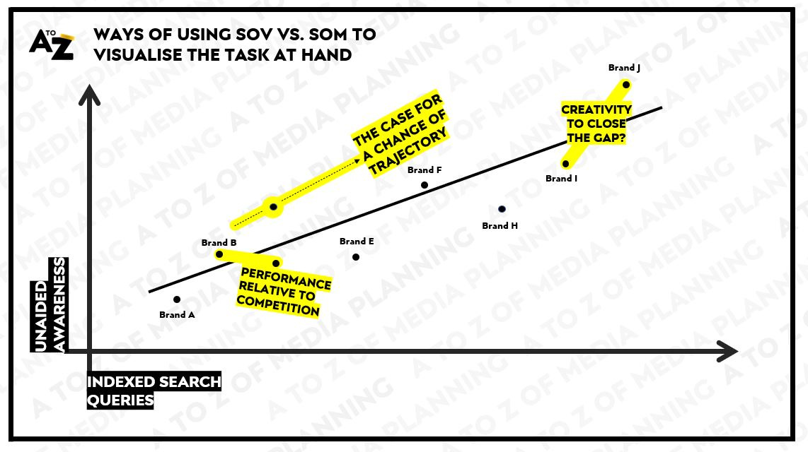
Share of Voice vs. Share of Market
One of advertising’s longest and most evidenced relationships is between a brand’s share of voice and its share of market.
If a brand invests more in media than its relative market share, the evidence indicates it will grow its market share.
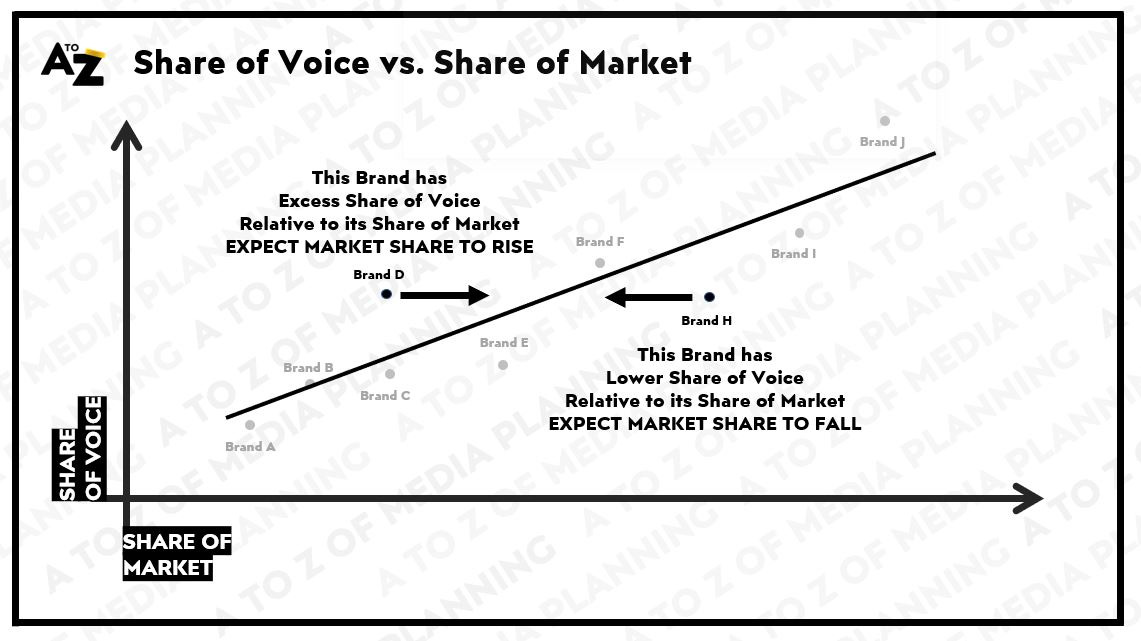
Sit above the line, you’re likely to grow.
Sit below the line, you’re likely to shrink.
Visualising where your brand sits relative to its competitors can help you better understand what’s going on or help you build a stronger argument to do something in a particular way.
It could be to show where your investment levels and likely trajectory sits relative to your competitors.
It could be to show how this is reflected in potential share/revenue gains over time.
It could be to show “the gap” that creativity might need to fill to offset insufficient levels of media investment to grow.
*Cough* It could be to show your client that their goals might be unrealistic.
Once you have a broad sense of what’s going on through techniques such as the above, the mind starts to shift to figuring out what the implications are and what you might subsequently do about it.
Strategy | Use data to assert exactly what needs to be done
Where data can come into its own at this stage in the planning process is to add clarity and (hopeful) objectivity to the challenge in ways that genuinely affect the subsequent course of a client and x-agency team’s actions.
Using data in ways that make it obvious to those involved about exactly what needs to be done.
The best example of this in our field in memory is from Sainsbury’s.
When faced with a challenge to generate £2.5BN extra revenue, the team at AMV BBDO didn’t hide behind the abstract nature of a target that big, they calculated that if they could convince every shopper to spend another £1 (and 14 pence to be exact) each time they came into store, they would not just achieve their goal but do so ahead of deadline.
So…Try Something New Today
When synthesised with other analysis showing customers were 'sleep-shopping' and in a rut with the things they buy and cook, Sainsbury's simply offered theirs and their competitors’ customers simple meal ideas, encouraging them to try new things; because in trying new things they’ll end up spending more on their shopping.

Fronted by a resurgent Jamie Oliver fresh from his successful appeal for healthier school meals, the success of the campaign generated £550 million in sales over two years.
Creating proximate objectives at this stage can do wonders for organizational energy and focus.
It can create a much more compelling argument for clients to support those recommendations too.
Data helps form the logic. However only you can bring the magic
Once you move from the initial exploration phase of a response to brief and figuring out the real problems and/or opportunities that lie ahead “data” in its unrefined form does much less of the heavy lifting.
The truly strategic and creative processes, be that to create and support a longer term play (e.g. Sainsbury’s Try Something New Today) or a specific campaign idea and activation (e.g. Sainsbury’s Latest Xmas Campaign) aren’t really helped that much through additional mining of data.
At least not from my experience.
When the process transitions from…
…the strategic (we need to get people to spend £1.14 more each shop)
…to the creative (by compelling the country to try something new today)
…to the implementational (through an ongoing series of recipe porn we take ATL and TTL to whet the nation’s appetite)
…it’s at the implementational end where data comes back to help build a more robust plan and plan of action for colleagues across both agency and client stakeholders to follow.
So with that in mind we’ll move towards the media planning and implementation stages.
Planning | Data that helps craft a more robust media plan
The fragmentation of media has created an almost infinite number of ways for brands and advertisers to connect with people in the real world.
If you distil what it is we’re asked to do as media planners, it essentially comes down to balancing three variables of data (sometimes explicitly in excel, more often than not in the back of our heads) with every decision we make about where to plan and buy media on behalf of our clients.
1. Reach | How many people within our target audience need to experience this campaign, activation, or idea within it, to think, feel or act in the way we would like them to?
Seems straight-forward, but we only have so much budget in most cases.
Therefore, the cost of reaching each person comes into the equation.
2. Cost | How much is it going to cost me to reach the people we need to reach, in the ways we need to?
Can we afford to reach everyone in the target audience, enough times to deliver a shift in their attitudes, their considerations or their behaviours? How much is one channel or context relative to another option? Is the desired idea from the creative agency affordable (or not)?
This, often is influenced by the final and most important part of the triangle.
3. Impact | Different channels and contexts have different effects on how communications are experienced, processed, perceived and remembered.
Or in simpler terms, their impact on people.
Take a crude example, with video or film.
A 60” brand advert vs. its equivalent cut-downs (or moving key visuals – Hello Meta!) will in most cases have a straight line downwards in in their ability to deliver communications outcomes on an impression by impression level.
More attention = a more memorable impression
But it’s not just what we’re distributing, the contexts those videos or films are experienced within matters too.
A skippable ad that is served to just me, on my mobile before a music video on YouTube vs. an ad that plays before the opening whistle of the World Cup vs. an ad that plays out when I’m sat down, over-priced popcorn in-hand, eagerly awaiting the 478th Marvel film at the Cinema will have differing effects on the potential impact of communications.
Whilst it may be more efficient to reach more people on YouTube, will it be as memorable as cinema?
Whilst it may be more effective to reach people in cinema, there aren’t many opportunities to reach 1BN looking in the same way, at the same time, before or during a world cup match.
Something our Volkswagen clients and their tiny little car took full advantage of at The Euros last year.

These data points on the cost of a potential media choice, the achievable reach of that media and the likely impact of that media all need to be juggled every time we build recommendations for clients.
Think of these datapoints like a triangle formed by string.
Pull too much into one aspect i.e. IMPACTful placements you’ll need to pay more for the privilege or reach less people with that placement and plan.
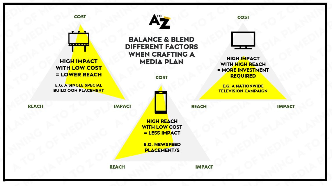
Alternatively if you wish to reach lots of people at low cost, you’ll need to do so in a potentially less impactful medium.
These rules of thumb are great to have in-mind in conversations with clients and creative agencies.
Yes of-course we can do X, but the implication is Y.
Every intention has an implication
When crafting the plan, a good media planner will sense-check the out-of-market and in-market audiences as they have defined them (See A is for Audience Part II for an explainer), with the relative cost of media to reach them, in the channels and contexts that make sense to deliver a campaign’s objectives.
Working top-down using a reach-curve to understand how much investment it will take to reach the broader category audience as you have defined it, in meaningful ways throughout the year.
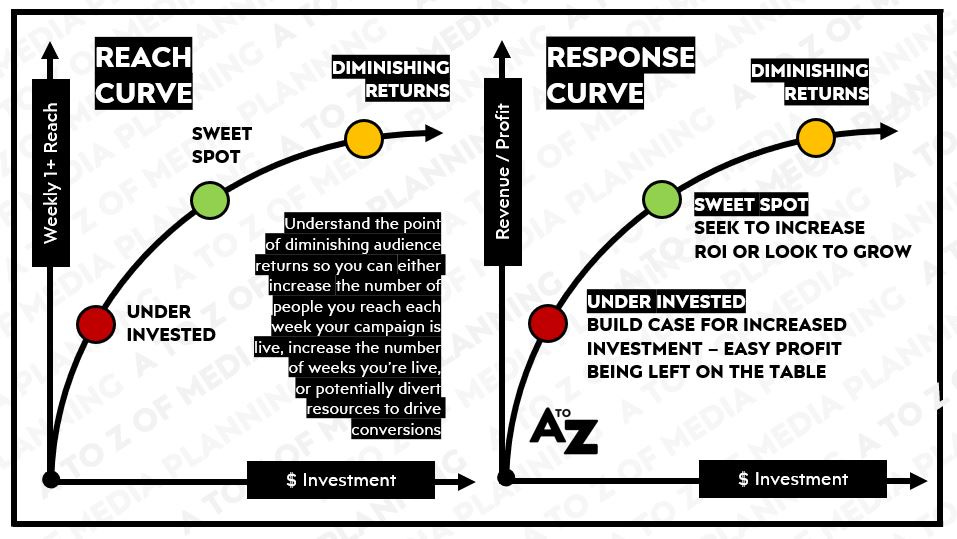
Or working bottom-up using a response curve to see at which points profitable sales can be extracted through tactics that facilitate a direct response to the advertising e.g. paid search or sponsored listings.
Not just calculating this at a total campaign level, but for each week your campaign is live so you can make adjustments where necessary.
I’ll touch on this in more detail in a dedicated post to Flighting.
Whilst a media plan is a best endeavour to deliver what’s outlined within it, nowadays you don’t just deliver the plan you have the opportunity to optimise it in-flight that may lead to even better outcomes.
Which moves on to the last part of this post about where data can help you make better decisions when the campaign is live, rather than post campaign.
Implementation | Data that helps standardise and optimise to the best possible outcomes
Once your campaign is live in the real world there are so many datapoints being generated across all manner of variables it can be difficult to stay on top of everything.
An example of this from the wild was the year or so I spent dedicated to running Unilever’s centralised media experiments.
A program was put in place where brands could pitch for funding to support their campaigns, as long as that campaign could help Unilever learn something faster than they as a massive corporation otherwise might.
e.g. Is it better to launch one big story, or tell stories in sequence for Dove…
e.g. Do more immersive films with interactive elements, result in higher BrandLift vs. standard films for Cornetto...
e.g. How much more effective is media triggered by factors such as weather, than scheduled media to sell ice-creams
Creating a hyotheses.
Testing it in the real-world.
Sharing the results with other teams that would benefit from what was learned so they can scale the benefits or steer clear of the drawbacks.
A big part of these experiments involved grouping x-functional resource in a room together in what we called “command centres”.
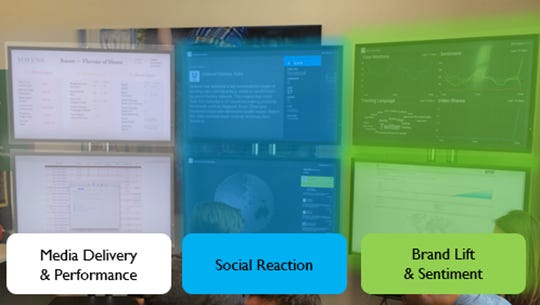
Launching campaigns. Looking at massive screens with loads of datapoints on them.
Making optimisations across channels to deliver the best possible outcomes.
All in the spirit of learning.
It was both fun and rewarding in equal measure.
Whist this grouping of resource served one purpose (expertise on tap) it also gave relatively junior brand managers the opportunity to put on a show for senior leaders at Unilever, that they otherwise wouldn’t get much airtime with.
In one of these experiments a senior leader came in, looked at the screens and said I don’t need to know all this BS (or words to that affect) just tell me the key things you’ll be tracking, that I can update my boss on, so it doesn’t look like I’ve given you the OK to waste a load of his money.
Said with a smile but you know it was meant.
I offered the following that I still readily refer to today.
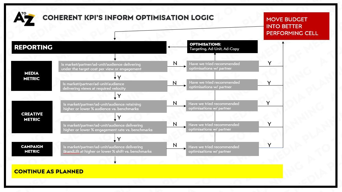
That for each impression you serve, at least through channels that allow you measure them, you want have a sense of…
-> The media performance are we reaching who we want to reach and where for a cost we’re comfortable with
-> The creative performance is that creative holding people’s attention or resulting in active engagement or conversation (if part of the experience)
-> The campaign performance for the people we reach, with the experience we’ve crafted, is it working to deliver an associated BrandLift or SalesLift
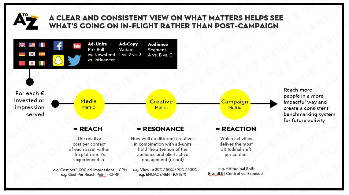
All of which you can measure in real time on big screens or small ones, together in a room or remotely over ZOOM.
By having a common view of what’s important such as the factors above, makes it really easy to create an optimisation logic that delivers more bang for each buck you subsequently invest in the campaign.
Across time if you take a record of what’s going on it also helps create a benchmarking system that knows what the good, the bad and the ugly look like for one campaign vs. another.
Be that for the immediate client, or for other clients across an agency group.
Whilst the above won’t be right for every type of campaign (these were mainly big, brand-building initiatives); the spirit of the above is applicable to all activity.
Creating a trail of logic for what you’re aiming at across different channels, so that you can take a read at different points, with the relevant datapoints and course correct if need be.
Not possible, without a sense of which data you need and why.
All possible though, without a pivot table (although in some instances they might be really helpful).
In Summary
This has turned into another monster chapter, thanks if you’re still with me, but I wanted to leave you with some takeaways from this longer than expected chapter.
1. Data can strip away the risk of subjectivity from your own decision-making
Don’t just look for data to support your existing assumptions, that is a bad use of data.
Use desk research and the data available through the sources you have to scan broadly, then use your focus to dive into the most pressing or interesting areas.
2. Data can strip away the risk of subjectivity from the opinions of others
Whilst you might think you have a really compelling narrative, there’s nothing like a well-evidenced datapoint to ensure clients don’t resort to subjectivity in their own assessment of your recommendations or results.
Proximate objectives are brilliant at winning over support and galvanising stakeholders.
Make the intangible, tangible and within reach where possible by putting a number on what you’re conveying.
3. Data can help scan what’s going on, fast, but should only be the starting point of your thinking
Use desk-based research, tools and techniques to scan what’s broadly going on, quickly, before putting your time and effort into figuring out the why behind what’s really happening.
Don’t forget there are real people on the other side of all datapoints though.
Clients. Competitors. Consumers. Colleagues.
It will most likely take real conversations with them to get a real understanding of what’s going on.
This is true at any point in from Pre-Brief to PCA.
4. Triangulate data from different sources to paint a more vivid picture of what’s going on
There is rarely a single source of truth.
Combine and correlate different sources to get to a more credible understanding of what’s going on. Be that share of voice vs. share of market, unaided awareness vs. search volumes, media metrics vs. creative metrics vs. campaign metrics.
You can combine different sources as long as logic and/or statistical significance connects them.
Creating that single source of truth, from many sources if need be.
5. Data can help form the logic, but only you can bring the magic
The most strategic and creative endeavours are ones that take place in the mind, or in conversation, not in a gsheet.
Don’t forget that.
Use the data to narrow your focus.
Use your imagination to unlock what the implications are or what might be possible through that sharpened focus.
I really hope you’ve found this chapter useful.
If you’ve got any other go-tos please share them with me and I’ll append them to the post.
Until next time…
Matt